Form=Function and the interplay between good design and functionality
A case study for Say Yeah’s Digital Insights page

Background
Since 2008, Say Yeah, a Toronto based digital consultancy has helped organizations of all sizes realize the potential of digital transformation via system strategy, service design, experience design, and continuous iteration. Clients have ranged from local institutions, such as Toronto Public Library, to large organizations like Microsoft.
In the summer of 2018 I began a short-term contract where I assisted with the development of a client project as well as as updating the agency’s Wordpress website. During my contract I had the opportunity to tackle the design of the Digital Insights page on the newly revamped website.
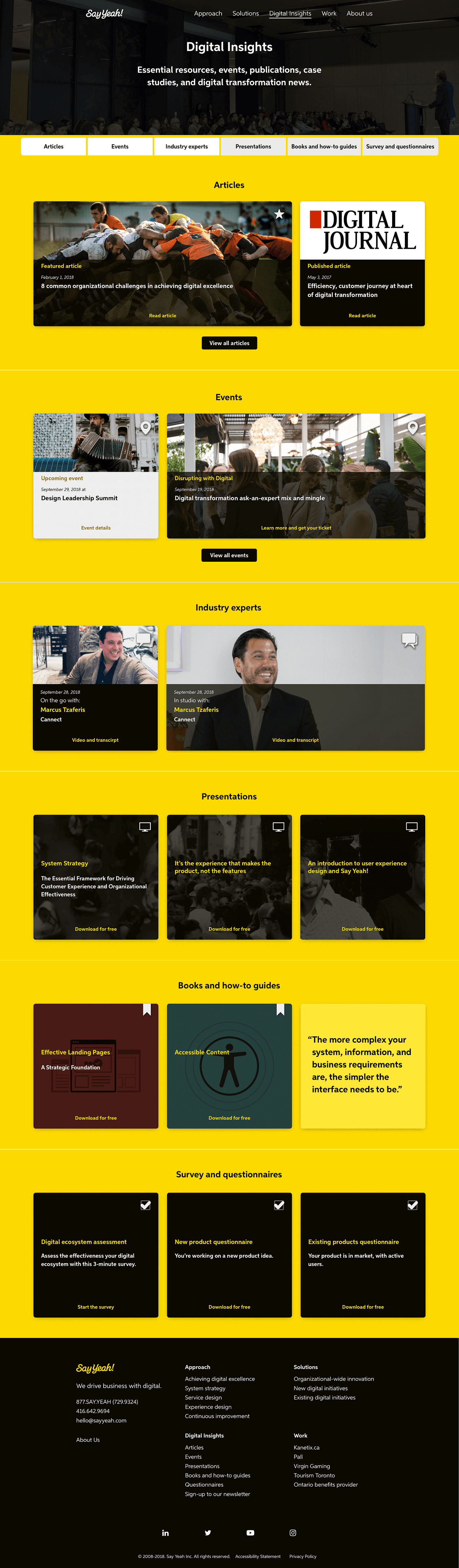
As per Lee Dale, CEO of Say Yeah, the Digital Insights page showcases resources written by the team, which date back to the agency’s inception. The categories and individual resources featured on the page includes:

The Design Challenge
Redesign the Digital Insights page’s information architecture and interface to improve the visitor’s experience while navigating the page, especially when sifting through the large collection of resources that dates back to the agency’s inception.
Digital Insights Page Layout

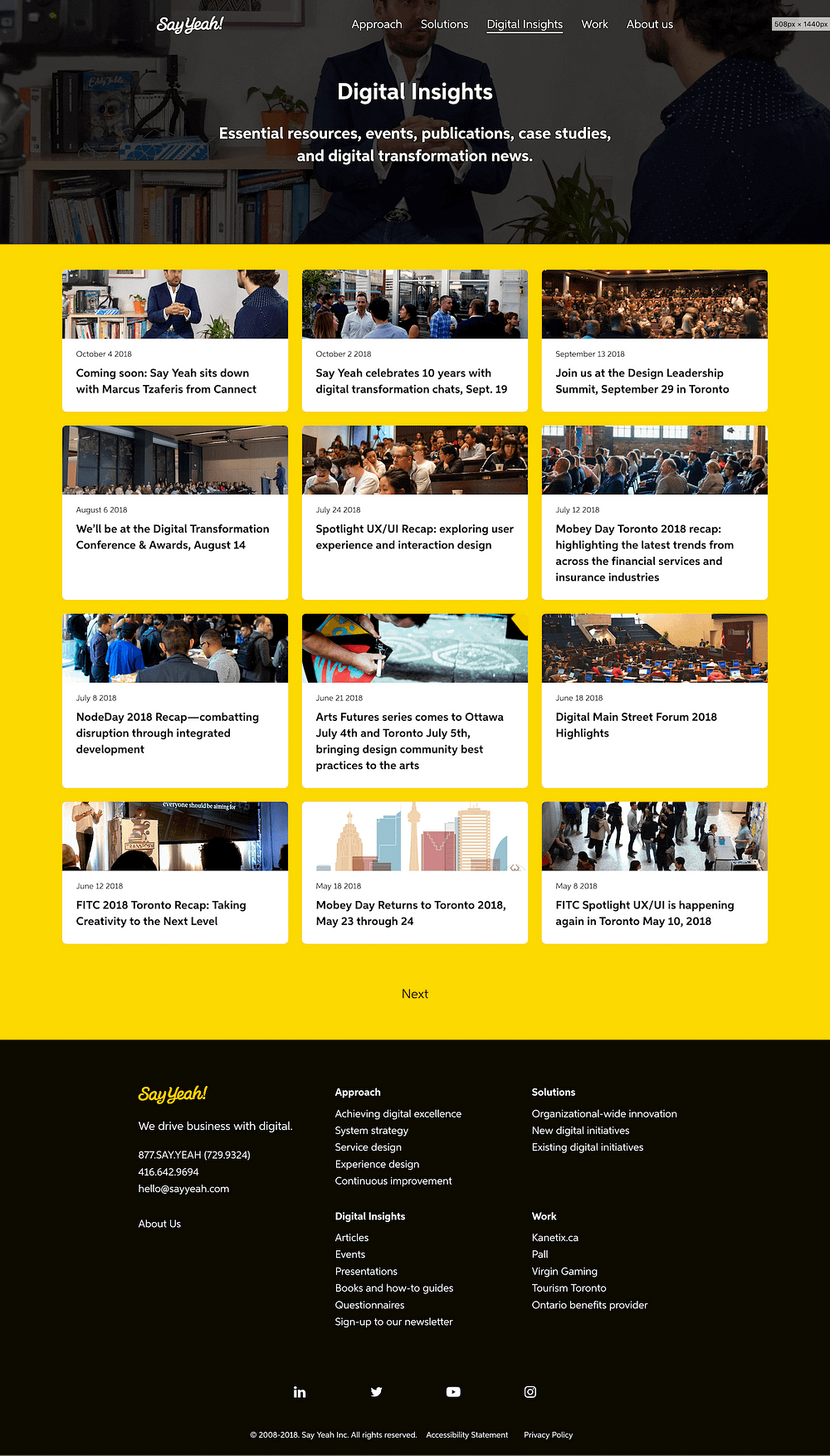
From initial glance of the page there are no headlines indicating the resource categories. Rather, the individual resources, which are represented via individual cards, are organized by publish date. Under that page architecture there could be a scenario where a visitor would not initially know or have access to specific resources since a maximum of 12 cards are featured on the page.
I propose dividing the page into individual sections based on the seven categories noted above. I believe the addition of the sections will improve navigation; thereby, making it easier to find resources on the page.
Design Iteration of Current Layout
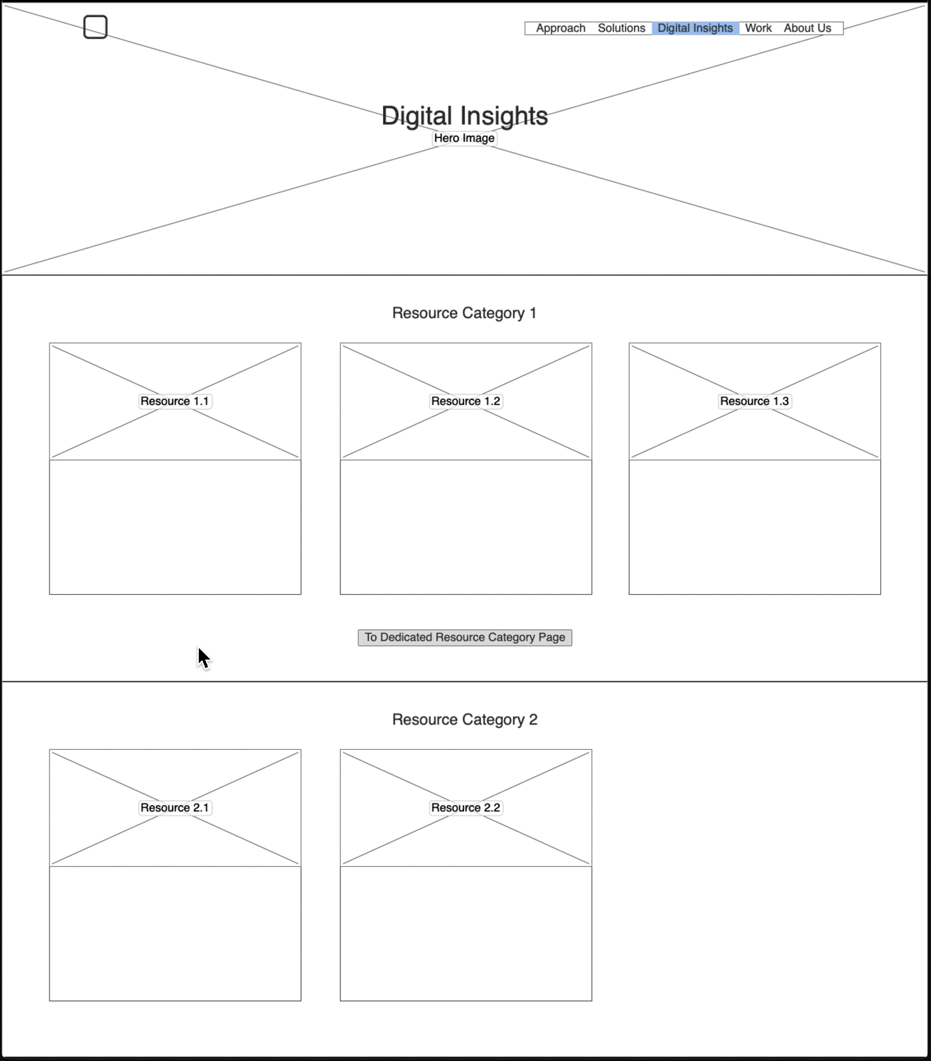
There is a lot of content on the Digital Insights page dating all the way back to 2008. Since the objective of the remove page is to showcase the latest content from the Say Yeah team, I suggest showcasing the latest three resources from each category. If there is more than three resources, I designed a method that would direct the visitor to the dedicated resource page, which houses all the resources that belongs within category.

Although the initial redesign was divided based on categories, I also suggested including on-page navigation. Its inclusion will immediately showcase the numerous categories under the Digital Insights heading without the visitor having to scroll down the page to find out.
Even though Lee agreed with the design suggestions thus far, he addressed a concern regarding the cards’ appearance.
Digital Insights Resource Card

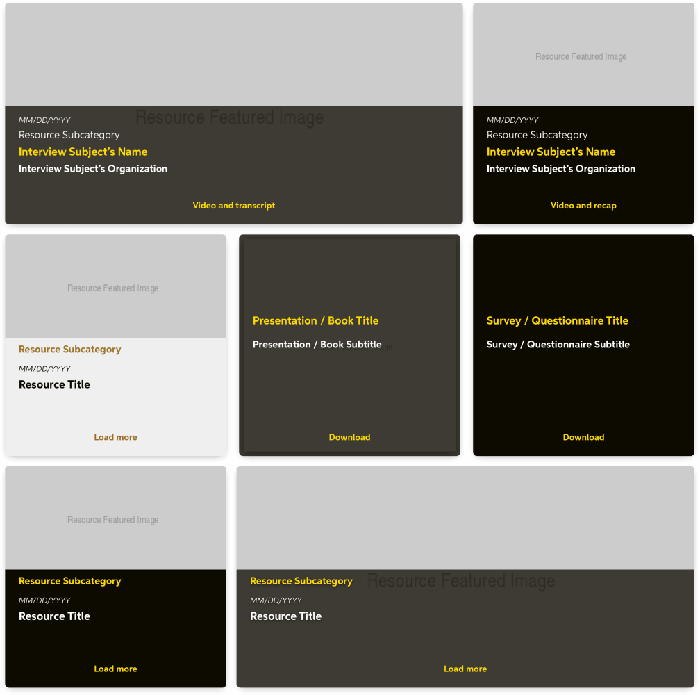
The current iteration of the Digital Insights Resource Card is successful at identifying the resource post; however, it currently lacks any trait that visually indicates the resource category/subcategory. The addition of a label would help, but it doesn’t address the issue regarding the card’s appearance, since each card’s layout looks identical to one another.
How have others had approached a similar scenario? The design pattern Apple Music employs when distinguishing between the streaming service’s exclusively curated playlists dedicated to a single artist/band is a great example:

Even though Apple Music and the Digital Insights page differ from one another, I believe the solution the Apple Music design team uses could be applied to the redesign of the cards on the Digital Insights page.
Updating the Cards’ Design:
After having shared my discovery to Lee, he introduced me to colors and fonts that currently exist only in Say Yeah’s publication and presentations that are yet to be incorporated onto the website.


Layout
Early in the card’s redesign I envisioned that the layout should be redesigned from the ground up. However, according to Jakob’s Law of Internet User Experience,
Users spend most of their time on other sites. This means that users prefer your site to work the same way as all the other sites they already know. Design for patterns for which users are accustomed. — Jakob Neilsen
Although I agree with Nielsen’s statement I still believe the design of the layout can indicate the different resources available on the page. Instead of a complete redesign, I suggest incorporating slight modifications to the card’s design indicating the varying resources that exist on the page.


Color
Aside from the different layout, color can be used to indicate the different resources that are available on the Digital Insights page. To achieve that, I suggest creating different color-schemes that use the colors associated with the agency’s brand as well as comply with web accessibility standards:

Typography
The combination of the different layout and colors alone is in stark contrast to the card’s past form; however, when it came to the card’s typography, there was room to explore. I initially suggested incorporating different font styles onto a single card, but due to its potential impact on the site’s performance, ultimately affecting its page speed score in the process, the idea was canned.
Even though being limited to using one font family may seem like a hindrance, it did encourage me to exploring using different font sizes and colors in order to highlight the different text-based information featured on a single card. Although the cards may differ from one another a pattern emerged:

Iconography
Even with all the changes made thus far I suggest incorporating an icon that is a visual representation of the resource category/subcategory. In doing so, it acts as a signature that compliments the text-based information.
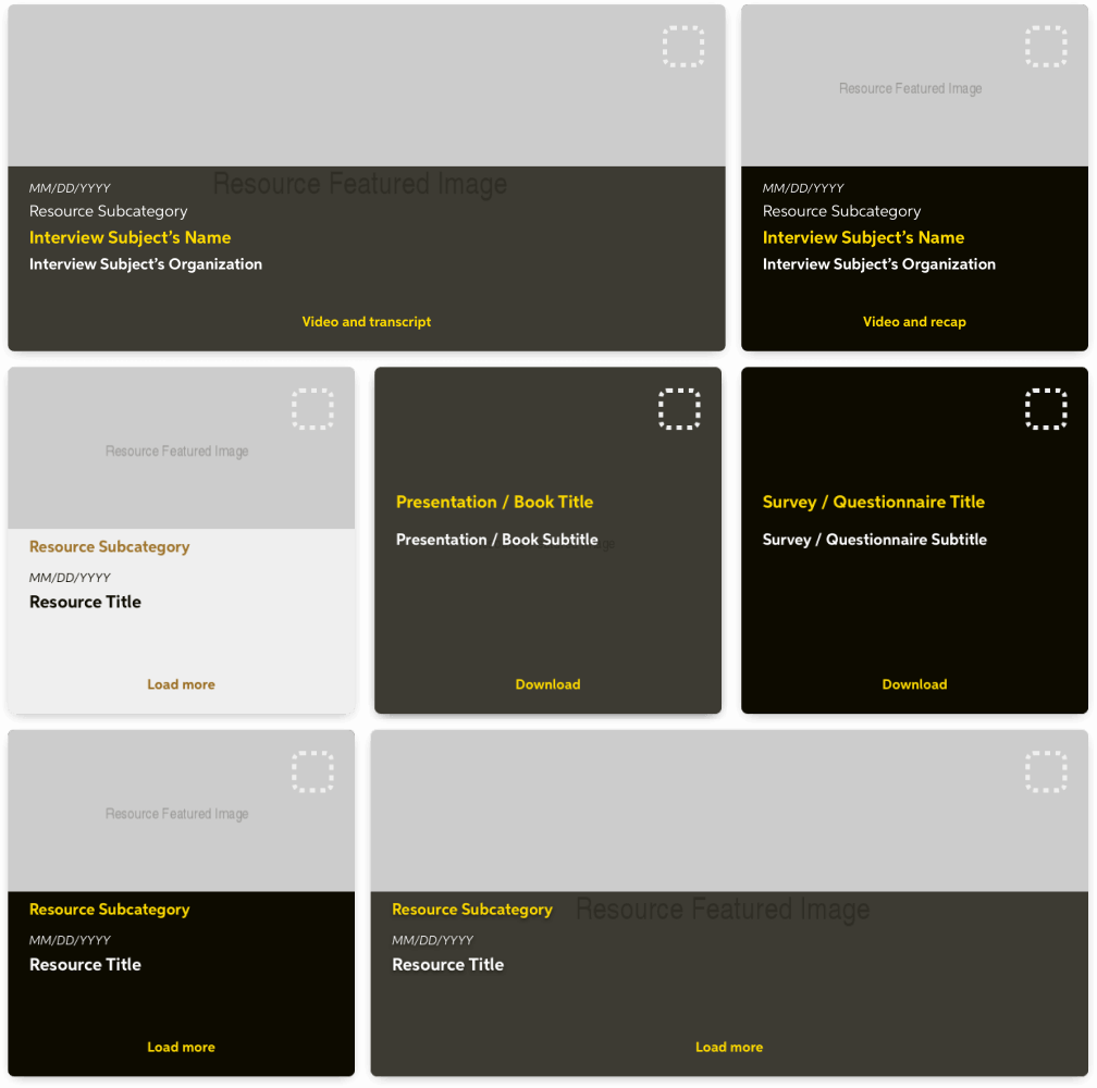
When sourcing icons, using the Noun Project, they must follow the Law of Prägnanz in order for visitors to easily, and quickly, decipher the different categories / subcategories of resources.

In order to create a compositional balance to the card that also compliments the card’s text, I suggest placing the icon on the top right quadrant of the card:

Design Output
The conversion from Sketch to code is a total breeze because I followed a consistent design pattern throughout the redesign process. However, due to the complexity of the Wordpress site’s back-end architecture the front-end code containing my design suggestions have yet to merge onto the live website.

Conclusion
The redesign of a website can have an effect beyond the functionality of a page itself. In late 2017, Dropbox underwent a complete rebrand and with that came redesign its website, including their pricing page. As Ariel Verber’s Medium post points out, the redesign reflected the new branding; however, the page saw a drop in several key metrics; thus, back to the drawing board. After the team came up with a list of hypotheses and compiled data, including from user-research, they came up with a design that not only outperformed the rebranded version of the page, but also the version prior to the rebrand.
Although my design has yet to go live, I believe once my suggestions are implemented its impact will improve the page’s overall user experience when navigating the Digital Insights page and finding any of its resources. Thus, if it functions well, with little to no friction for the page’s visitors maybe that’s the very definition of good design.
