Laying down the foundational building blocks at a London-based start-up
A case study for A Million Ads’ design principles and design system

Introduction
This case study is about the contribution I made at a London-based startup as their first user experience hire. At A Million Ads I helped lay down the building blocks for the organization’s design principles and a first iteration of their design system.
Background
A Million Ads is an ad-tech startup that is on a mission to “[make] personalized and dynamic advertising that feels more relevant, context-aware and that truly connects with people.” (Employee manual, 2019) It achieves that by using data the end user has already (and knowingly) provided when they sign up for an online service like Spotify. The data being collected can range from the individual’s age, gender, their location, weather, as well as knowing whether they have already come across that advertisement. Ultimately, the collected data creates an advertisement that is catered to the individual listener/viewer at that specific time and place. In order to create these types of advertisements, creatives, both in-house and external creative agencies, use Studio, a web-application built by A Million Ads’ in-house product/engineering team. Studio is a web app to test and create personalized online audio and video advertisements for their clients. A Million Ad’s in-house creative team has worked with an impressive list of clients that includes Adidas, British Airways and McDonalds.
Since joining in June of 2019, I, along with the organization’s first Product Manager, have helped A Million Ads’ product/engineering team release many features and improvements to Studio. That includes, but not limited to, updating the application’s dashboard, improving the quality assurance process, as well as re-imagining the uploading experience. We encouraged that all members of the product/engineering team:
- Verify their assumptions using research.
- Build prototypes, no matter the fidelity.
- Push small improvements and features to the develop environment more frequently, knowing that each push to the development environment leads to a fully-fledged improvement and/or feature that is ready for beta and eventually release.
After a few months providing value to the organization by delivering solutions that addressed user’s needs, and supported the business, I was then given the opportunity to pursue something that had yet to be addressed within the product/engineering team.
Design principles
From the company’s inception in 2016, all design decisions for Studio were made by front-end developers, the chief product officer, and A Million Ads’ founder/chief executive officer. Even though everyone’s contribution helped launch a business, it did so at a cost. Throughout Studio design inconsistencies exist due to conflicting design decisions. In order to ensure alignment from everyone Studio needed a clear set of design principles. “Design principles are a set of considerations that form the basis of any good product.” (Design Principles) Most importantly, Design Principles can help teams make decisions.
Working closely with both Mohan Taylor, A Million Ads’ Chief Product Officer, and Richard Taylor, the organization’s Senior Design Engineer, we began laying down a list of design principles we believed were in-sync to the way design was being approached within the product/engineering team and the organization as a whole. We had generated up to ten principles during those sessions.
One morning on my way to the office I was listening to the Design Better podcast episode, What it takes to build a connected workflow, featuring Bob Baxley. A Silicon Valley icon, Bob worked at Yahoo!, Apple, Pinterest, and is currently the Senior Vice President of Design and Experience at ThoughtSpot. Bob’s story inspired me to reach out to him. We connected over a Zoom call where we talked for over an hour about our journey into this field, as well as design leadership. Just before our conversation was coming to a close I asked if he had any advice with regards to establishing a set of design principles for a software application. Bob had bestowed three key points:
- Your design principles need to reflect your organization’s own principles. In many ways, they need to be an extension of that.
- These principles are the de facto rules/constraints that nobody in the team can argue with. Once it’s set, that’s it.
- Finally, your design principles need to be easy to remember. Hence, these principles need to be ingrained in the heads of everyone that is involved in building the product.
Studio’s design principles
The following day I revisited the list of proposed design principles and cross-referenced them with A Million Ads’ own principles:
- An audience-first, creative-led approach will make our product and work stand out.
- We can use technology to enhance human interaction, not replace or undermine it.
- We have a responsibility to people and the planet by treating both with respect.
After some adjustments, and suggestions from Mohan and Richard, we had devised four design principles:
1. The WOW factor!
There are three responses to a piece of design — yes, no, and WOW! WOW is the one to aim for. — Milton Glaser
A Million Ads aims to stand-out from the rest of the ad-tech community since its focus is on personalizing the advertising experience by making it dynamic. As a result, Studio should reflect that from its functionality all the way to its micro-interactions. The goal is WOWing its users by demonstrating how Studio differs from any software used in the ad space.
2. Consistency
A consistent experience is a better experience. — Mark Eberman
From the use of language to the specifics of styling, consistent design patterns employ familiar mental models in order for Studio’s users to navigate with ease. Without consistency, Studio can appear daunting and confusing; hence, causing a detrimental hit towards the usability of the web application.
3. Progressive disclosure
Simplicity is not the goal. It is the by-product of a good idea and modest expectations. — Paul Rand
To ensure that Studio doesn’t overwhelm its users of its many possible options, only the most relevant functionality is featured initially. Examples of progressive disclosure can be found throughout Studio revealing the many ways users could include further dynamic features to an ad that would align with their client’s needs.
4. Design with the end user in mind
Want your users to fall in love with your design? Fall in love with your users. — Dana Chisnell
Studio was designed with its users in mind. They are made up of creative professionals who are familiar with a suite of software that allows them to create digital audio-based and/or video-based advertisements. Without 1.) the WOW factor, 2.) consistency and 3.) progressive disclosure working in unison, the overarching design principle, 4.) design with the end user in mind, would not be realized.
The culmination of these four design principles went beyond defining the look and feel of Studio, but was also how the product/engineering team would devise solutions for the business. With the design principles set in stone, it was a good opportunity to lay down the groundwork for Studio’s design system.
Design system
Since joining A Million Ads’ product/engineering team I took note of any design inconsistencies in Studio. My knee-jerk reaction at the time was to establish a design system. A design system can be described as a product that supports other products. In addition, a design system is “[a] collection of reusable elements, guided by clear standards and structures, that is coherently organized to let [a product/engineering team] build better products faster.” (Design Systems for People) Once the design principles had been established, and agreed upon by the entire product/engineering team, work on the design system commenced.
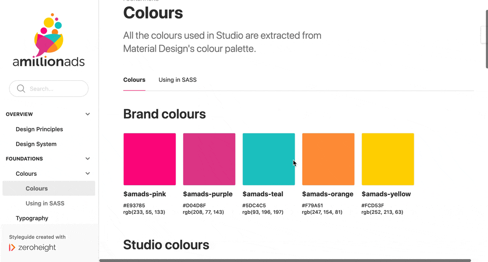
Before actually developing the A Million Ads’ design system I decided to spend some time researching how noted organizations who champion design established their own design systems. The organizations I looked at included: Shopify, Mailchimp, GOV.UK, Google and IBM. The comparison of each organization’s design systems not only outlined their similarities, as well as their differences, but also inspired how I wanted to approach A Million Ads’ design system. I had decided that the first iteration of A Million Ads’ design system didn’t need to be “perfect” and “all encompassing” but something that could help not only guide the product/engineering team but also the first step in establishing the foundation for future improvements and iterations of this document. In addition, rather than create a solution from scratch I had opted using an existing tool/service instead. Having seen what tools were available, I shared my findings with Mohan and recommended zeroheight.
zeroheight is a web-app dedicated to building and maintaining design-focused documentation, such as a style guide or a design system. Aside from the fact that it’s used by The Guardian, Red Bull, and The City of Amsterdam, it’s also free and easy to use, allowing anyone to contribute to the document. zeroheight also integrates with the latest industry-standard user experience design tools, such as Figma, Adobe XD and Sketch. In addition, front-end code snippets can easily be embedded into the document via vanilla HTML and CSS, or by using Storybook.

Aside from being a single source of truth, the design system was also meant to engage a discourse with members of the product/engineering team. Just because something has been documented doesn’t mean it’s sacred. My intent for Studio’s design system was to be a living document where anything was up for debate, especially if there was an approach/solution that could greatly improve Studio’s user experience, thereby allowing every member of the product/engineering team to engage with the design system and contribute.

Results
The adoption of the Design Principles was a success. Whenever anyone brought forth a suggestion they made sure it adhered to the design principles. Its success also became apparent whenever I was called out for proposing a solution that diverged from those principles. Even though there was a slight sting whenever an idea was rejected, having those design principles recited back to me was a clear indication that my contribution made an impression to the product/engineer team members. Although I am pleased by this I can’t share the same sentiment with regards to the Design System.
Even though I am proud of having laid the foundation for A Million Ads first attempt of a design system, what I had contributed thus far does not include the source code to recreate any of the components listed in the document itself. Thus, I strongly felt that the current iteration of A Million Ads’ design system is more akin to style guide instead. In order for this document to be a full-fledged design system it must include the source code to recreate all listed components within the living document. It’s a common feature I’ve noticed when comparing many notable design systems from organizations who have made their design system publicly available. The inclusion of the source code for each component acts as reference point/guidelines for all front-end developers within the team, including those newly joined, by eliminating the need to recreate said component(s) and ensuring that consistency is upheld.
At the time of writing this there had been two people within the product/engineering team that contributed to the design system, aside from myself. To remedy this, there could be an opportunity to engage other members to contribute by allocating time during dedicated front-end or Product/UX meetings where discussion can be had about anything that pertains to the living document. Even though the current iteration of the document is front-end heavy, it doesn’t need to be that way. For instance, back-end developers could contribute to this document by outlining coding architecture and patterns as well. Ultimately, the possibilities of how this living document can evolve is endless.
Conclusion
In August 2020 I had resigned from A Million Ads to pursue another opportunity. I have had the great pleasure of working on numerous projects with talented business-focused engineers. And with the help and guidance from product leaders within the organization, and from Bob Baxley, the Design Principles and the early iteration of the Design System are the first of many building blocks that have helped further solidify the impact and value of design at A Million Ads. I hope this case study inspires you to do the same.
